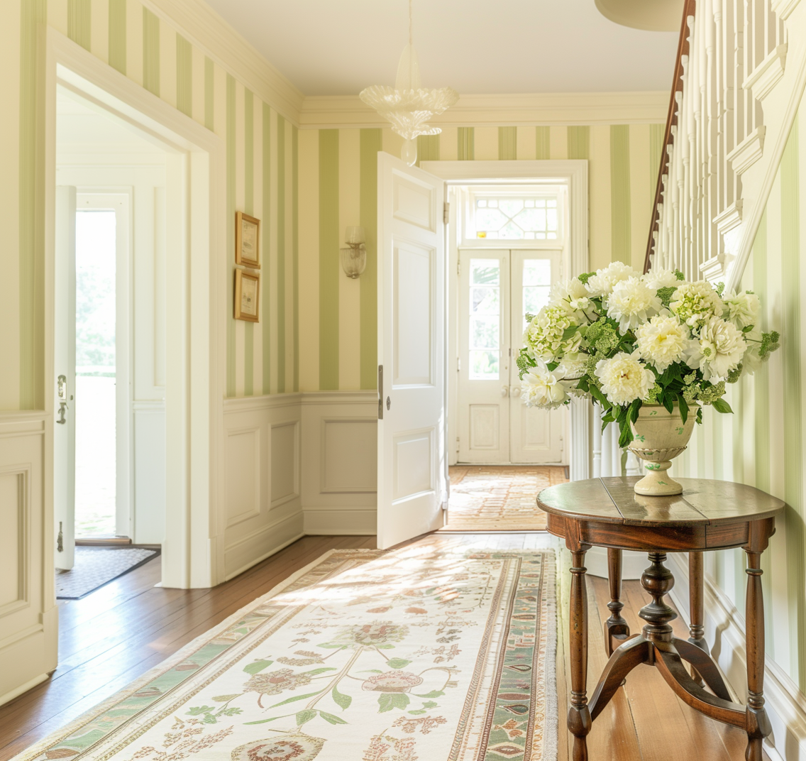
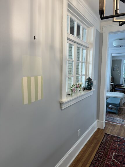
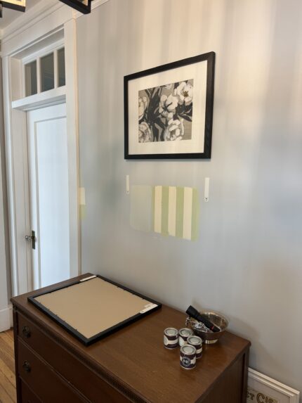
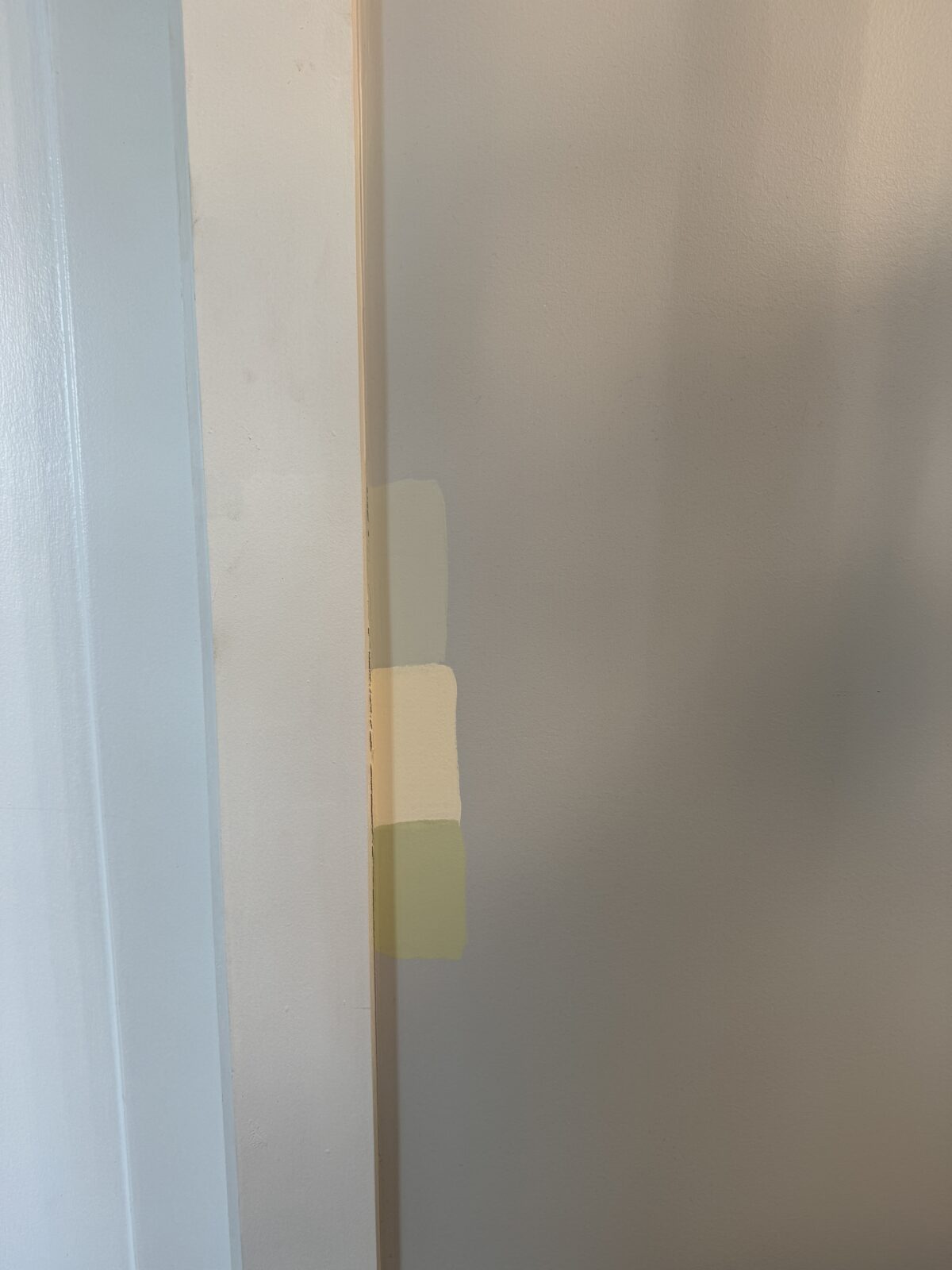
Last week I had the opportunity to test swatches of some colors I wanted to use for a fire refresh. As mentioned in the kickoff post, I was thinking of recreating the Farrow and Ball closet stripes with paint or using a pale powder. I wanted to do something bold, but after seeing this area I had to ask myself, Am I really so brave?

(AI generated image created for this project)
As I embrace bold fashion choices again, I still find myself still drawn to the nuances of home design. I’m a modern traditionalist at heart, trying to blend my husband’s preferences with minimalist mid-century design. As mentioned before, this foyer is going to be the “test” if we want to carry this design next door, and, although I still love the yellow and green stripes, I just have to use it for this room.
Our foyer layout bridges the white dining room and muted blue living room in an oversized transitional hallway. It really tested my will for courage. The striking stripe will really hit you in the face when you enter the house, and I want the house to slowly pull you in as you cross the threshold.
So, in a surprising ending, I will proceed with the pale powder.


However, if you plan to experiment with changing a space in your home, here are my best practices to help you find the color you love:
- Check swatches on each wall to make sure the color doesn’t go too gray or reflect a different shade in different lighting.
- Test swatch next to the trim. If your trim isn’t white, you’ll especially want to make sure the color you choose doesn’t clash.
- Test swatch somewhere you can hide the color. I tested under existing art so I could see how the color would look at any time of day without it being fully visible. (Speaking from experience, I know that test swatches can hang around longer than you plan before painting, so it’s best to hide it.)
If you’re interested in the colorways of the test swatches, I’ve listed them below.
Pale powder
green field
Tallow

